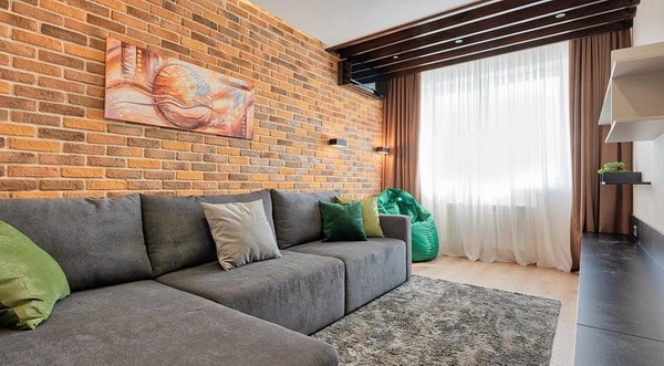
 What do professionals refuse in their projects today? For example, limestone as a facing stone and lime color. Details are in our material.
Interior trends are changing. Sometimes every year, sometimes less often. Just like anti-trends 2024. We asked designers to tell us what, in their opinion, is irrelevant today.
Decorative plasters, excluding microcement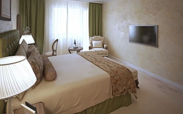
Designer believes that decorative plaster will look appropriate in a loft or in “folk” styles. But for a typical modern interior, she would not use this coating.
“In a loft, country, Mediterranean, narrow-style interiors, plaster looks appropriate. For a typical modern interior, this is an alien element that has nothing to do with the word “stylish”. Because stylish is about conforming to any style, ”the designer explains his position.
Decorative brick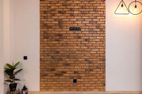
Designer believes that this technique is a thing of the past, as well as borrowing the loft style in general.
A couple of years ago, many clients indicated these techniques among their references or specific wishes. Now this is not at all. Everyone finally fell in love with painted walls – precisely painted, not wallpaper and not wallpaper for painting.
Today, some apartment owners still use this technique in the design of a balcony or loggia in order to give these rooms more comfort. Wall cladding with white brick or brick-like plaster is a technique that has lost its relevance. The current replacement for obsolete brick is rough plaster, stone or concrete.
Triptych paintings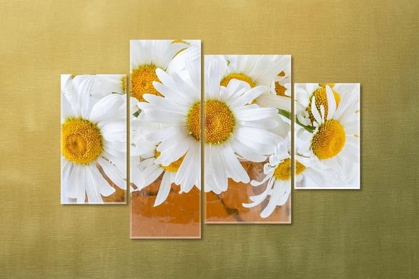
We are talking about photo-printed paintings, which are divided into three parts and represent an “ensemble”. Sometimes they are also called modular.
Pictures as full-fledged parts of the interior must correspond to it. This means that the plot of the image and its presentation should be organic within the chosen style direction. For classic interiors, these are paintings in frames, with carved or laconic panels, in enamel or in wood (depending on the color of the furniture). According to the plot, these can be landscapes or engravings, botany and occasionally portraits, but you need to be extremely careful with this. In minimalism – laconic geometry, color blocks, it is possible without a frame, a bare canvas on a stretcher. If we are talking about styles with a rebellious character, for example, a loft, these can be bright posters in a black frame or without it, more often without a passe-partout, with outrageous images. In Scandi – black or white laconic frames with a passe-partout, with sentimental images, cozy, in halftones, lettering is possible. The main thing is to understand
Tropical prints in abundance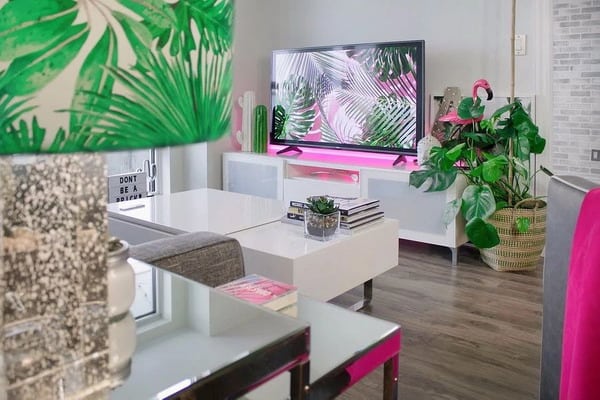
The tropics have been a fashion trend for a long time, especially often found in the form of patterns on wallpaper, in textiles and posters.
We suggests reconsidering the approach to the “tropical” theme: “Although tropical prints are limitedly present at exhibitions and stands of companies, it seems to me that they are no longer so relevant. Now it has rather been transformed into natural plants and attempts to recreate small paradise oases from plants, but at the same time, boho interiors in the Balinese or Indonesian style are also no longer relevant.
Stone-limestone in the form of decoration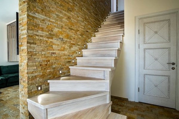
This design option can be called a sign of the interior of the 2000s or even earlier periods. Then walls, doorways and arches were trimmed with limestone. Today, designer recommends abandoning this finish.
It is better to replace it with large, rock-like pieces of stone, with dense packing without seams. And this type of wall decor is only suitable for eco-styles in order to fill the interior with natural materials as much as possible. And for small apartments, it is better not to use such techniques, because they require scope and air to look organic, ”explains the designer.
Turquoise and lime color in large quantities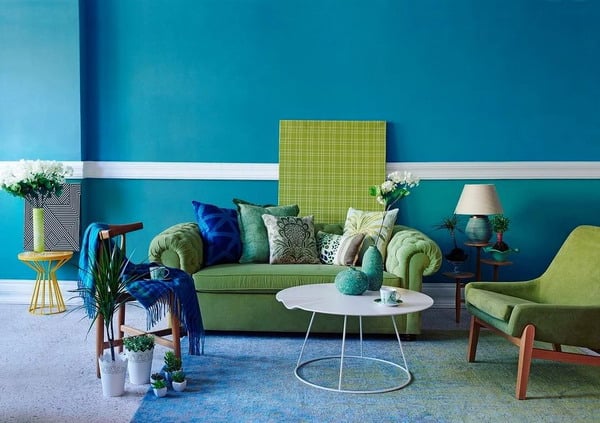
Designer recalls that these colors were actively used in the 2010s, once they were even chosen as the colors of the year by the Pantone Institute.
You should not use these colors at the same time in wall painting, furniture upholstery and window decoration with textiles. It is best to keep your favorite shade in accessories and decor, which are interior details and do not carry the main style load.
Mosaic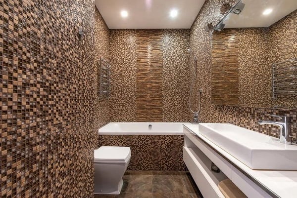
Choose large-format tiles (for minimalist, austere styles) and small-format tiles with interesting geometry (for Scandinavian, some loft options, and even classic styles). Mosaic is acceptable in the Mediterranean style, but then it should be made of natural stone, shells and, optimally, irregularly shaped, as if assembled from stones from the coast. Or in modern styles – in this case, the mosaic should be a structure of elements of a complex geometric shape. Hexagons, narrow stripes, triangles made of the same material as the main tile of the collection – yes, original. Small plastic squares are a disaster,” explains the designer.
The abundance of brass parts in minimalism
Brass is the trend of recent years. And we does not deny the popularity of brass. But he recommends being more careful with her in minimalist interiors.
The abundance of brass details in minimalist interiors, for example, inserts in porcelain stoneware or parquet, lamps, brass skirting boards, integrated details in furniture or kitchens, no longer surprise and do not look as fresh as some time ago.
